The Market Is Delusional: Earnings Growth Rates Are Dramatically Overstated
June 17th, 2017 by Jason B. Vanclef
Jun.16.17
Seeking alpha.com
Summary
Corporate profits after tax continue to represent a historically large portion of the economy.
Earnings growth relies on one of two terrible theories. Either more of the pie goes to corporate profits or GDP suddenly roars back to life.
The labor force growth rate is anemic at best and hours per worker have been trending downward or stagnating, depending on your period of reference.
Growth in productivity (GDP per worker hour) remains exceptionally low with no clear catalysts to send it higher.
Investors can ride out the storm by using a more defensive portfolio allocation strategy that emphasizes higher yields and lower volatility.
Investors and analysts are capable of deluding themselves into believing some of the most incredible things. The latest delusion involves the premise of rapid GDP growth driving up financial values while the very fundamentals they would rely on are moving in the opposite direction. Allow me to reminisce for a moment.

I remember speaking with an analyst who had been in the heart of the financial crisis. He was running models valuing the mortgages and explaining how, even years later, there was no way to see it coming because their models didn’t predict it. When asked how they figured the loans would always be repaid, he said it wasn’t supposed to matter because housing appreciated at 6% per year to infinity so the collateral was always worth more than the loan. I sat there slack-jawed until I asked him, “So what level of inflation were you projecting?” The answer was in line with the Federal Reserve’s goal, which means around 2%, but it was evidence that they were perfectly content to believe ideas that were mutually exclusive. Housing prices could not possibly appreciate by 6% per year with inflation running 2%. When I asked “Why were you buying anything other than stock in homebuilders since their operating margins must’ve been set to explode?” the glaring began.
It’s a tale as old as time

Accepting two ideas that are mutually exclusive, or very close to it, it is far from a new concept. The simplest way to do it is to simply refuse to look deeper into implications of each belief. My favorite example of the absurdity today comes from investors believing that earnings growth is set to explode and remain high for many years to come. There are a few ways to rationally support such an argument, but each falls apart upon closer inspection.
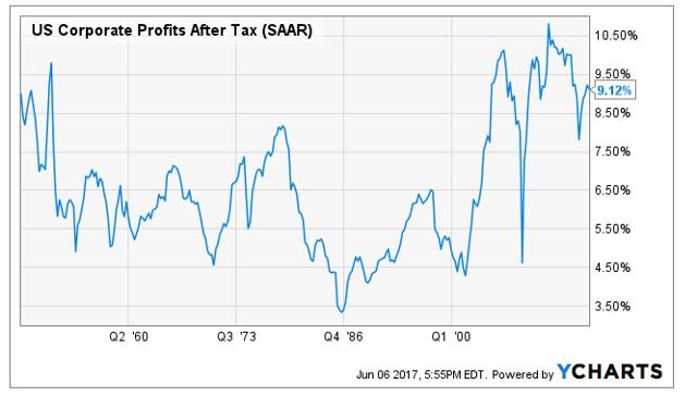
The first idea is that we will see major tax reform and because of this reform corporate profits will skyrocket. To get there, we simply look at current tax rates, chop them, and say the reduction in taxes equals the gain in profits. That is inherently absurd because it would require an absolutely massive increase in the deficit. One idea for how to fix that is to raise the taxes on individuals, but that seems unlikely. By historical measures, corporate profits after tax are still relatively close to record levels.
See the chart below comparing those profits to GDP:
Shall we model for corporate profits after taxes becoming an ever larger percentage of the total economy? If so, then we are every bit as absurd as analysts believing housing might appreciate by 6% indefinitely on the basis that it recently had.
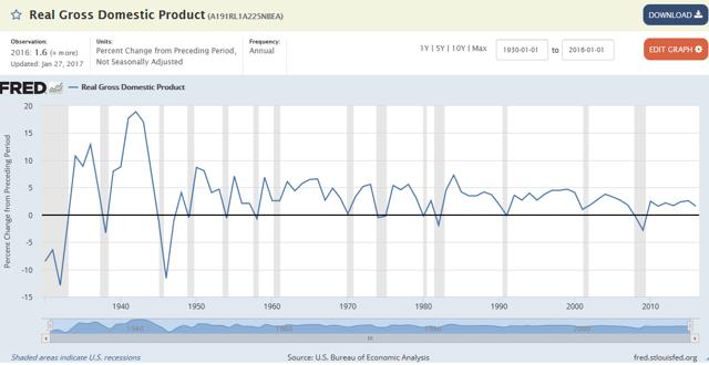
Perhaps we should get back to the premise that GDP growth is going to average 4% in the future.
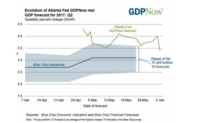
We can look at the projections posted by the Federal Reserve Bank of Atlanta:
Those estimates were as high as 4% prior to a disappointing jobs report a couple days earlier. That brought them back to 3.4%, which is still high enough to be laughable over the long term. To demonstrate how absolutely absurd these hopes have become, I will go with the lower 3.4% value. This is entirely possible for a single year as an outlier in a data set, but it is not “the new normal.”
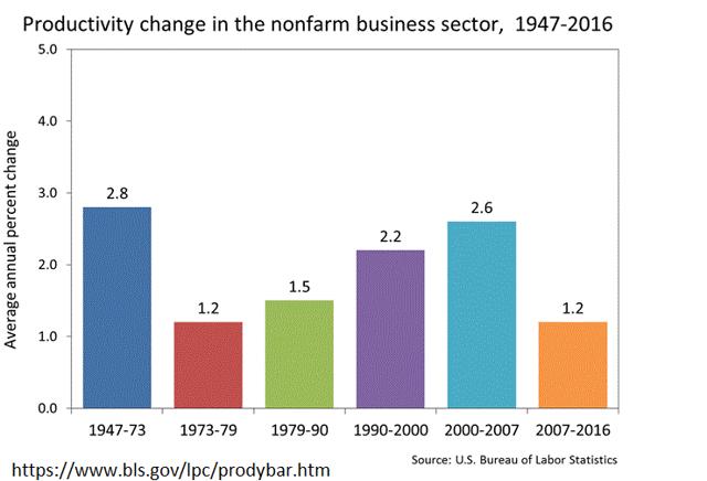
Below are the average growth rates for productivity across the non-farm segment of the United States economy.
Since far fewer people are working in farming now, it makes sense to exclude it from any projections about future growth rates. Since the great recession, productivity growth has been terrible. The one major surge we saw was from 2000 to 2007 where the widespread adoption of the computer meant we could streamline several mundane tasks.
Since the great recession the growth has been utterly pathetic.
It Is Not All About Productivity
Productivity can be boiled to a pretty simple formula: Productivity = GDP / hours worked.
When the productivity growth rate is 1.2%, how do you get to 3.4% GDP growth? You by definition must have growth in hours worked equal to approximately 2.2%. Remember, the baby boomers are retiring. Revisiting the Bureau of Labor Statistics, we can see their projections for growth in the labor force:
” The U.S. labor force – the number of people working or looking for work – is projected to reach 163.8 million in 2024. 2 The labor force is anticipated to grow by 7.9 million, reflecting an average annual growth rate of 0.5 percent, over the 2014-24 period. The growth in the labor force during that timespan is projected to be smaller than in the previous 10-year period, 2004-14, when the labor force grew by 8.5 million, or 0.6 percent, annually, on average. (See table 1.) Two intertwined changes have affected the growth of the labor force over the past several decades: changes in the demographic composition of the population and changing labor market choices.”
If we continue to have productivity growth at 1.2%, then .5% growth in the labor force means only 1.7% growth in real GDP. However, there is still a way out.
Growth in the Labor Force doesn’t have to equal growth in Labor Hours. If we simply make every worker take on longer hours, we can still see that GDP growth. To get the extra 1.7% (added to 1.2% from productivity and .5% from labor force size), we simply need the average work week to grow by 1.7% per year indefinitely.
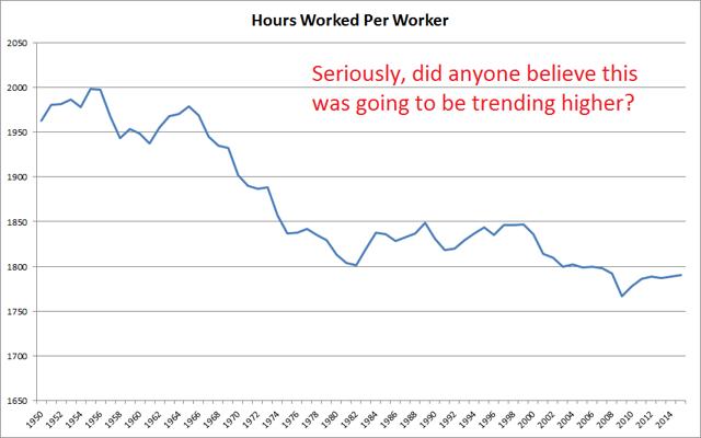
Do we have a trend toward each individual in the labor force working more hours? Let’s check some data from the OECD (Organization for Economic Cooperation and Development). By downloading their data into excel and charting it, I come up with:
So the average hours worked has declined to less than a 36-hour work week and productivity growth went back into the gutter with a low expected growth rate in the labor force. Precisely how is GDP growth supposed to “return to 4% per year?”
Perhaps we should look for periods where GDP growth rate was around 4% as a guide.
The highest value since the turn of the century was 3.8% and it came in 2004. We had a few values over 4% in the 90s. Oh, that won’t work for today though. The 90s had productivity growth running 2.2%. They also saw average annual hours increasing from about 1,825 to around 1,850 per year.
Let’s take a look at another chart that is a bit older for the growth rate in the labor force:
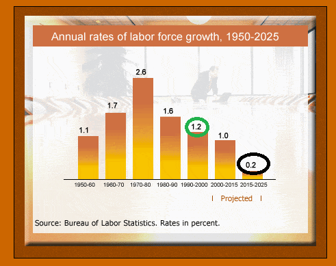
It was running 1.2% for the 90s.
Let’s put those numbers together. We were able to see GDP growth rate around the 4% level throughout the 90s because the labor force grew by an average of 1.2% per year, productivity grew by an average of 2.2%, and total hours per worker increased slightly (around .1% to .2% per year). That gets us up around 3.6%.
As it stands, there is no evidence to suggest that we are about to see any of those positive factors for GDP growth. We have pretty good projections for growth in the labor force. Absent a huge influx of immigrants, the labor force is unlikely to grow materially beyond those projections. Even a higher birth rate would take 18 years to work its way into the labor force.
Why Does This Matter So Much?
Besides the domestic equity indexes being through the roof, it begs some major questions about the consequences of financial policy. Remember that the Federal Reserve has two primary objectives. They are to maintain monetary stability, which they define as 2% inflation per year, and to encourage full employment, which they define as 5% unemployment. In my view, full employment means 3% unemployment, but that rabbit trail would take far too long.
The equity markets are convinced the Federal Reserve is on a path of several increases in interest rates. Some market participants think that won’t be a big deal, but it is an absolutely massive deal. It was almost a year ago that interest rates were bottoming out. Consider the change in valuation of the top banking stocks:
| Ticker | Name | Market Cap | 12 Month Price Change |
| (NYSE:BAC) | Bank Of America Corp | $236,656.2M | 79.20% |
| (NYSE:C) | Citigroup Inc. | $177,089.5M | 51.70% |
| (NYSE:JPM) | J P Morgan Chase & Co | $309,022.9M | 40.00% |
| (NYSE:PNC) | PNC Finl. Services Grp | $59,442.4M | 50.90% |
| (NYSE:WFC) | Wells Fargo & Co | $270,304.9M | 14.30% |
| (NYSE:USB) | U S Bancorp | $89,067.2M | 31.00% |
| (NYSE:BBT) | BB&T Corp | $35,773.3M | 23.80% |
| (NYSE:STI) | SunTrust Banks Inc. | $27,171.4M | 36.80% |
| (NYSE:MTB) | M&T Bank Corporation | $24,993.7M | 37.40% |
| (NYSE:KEY) | KeyCorp | $20,365.7M | 68.10% |
| (NASDAQ:FITB) | Fifth Third Bancorp | $18,899.3M | 43.20% |
| (NYSE:CFG) | Citizens Financial Grp | $18,544.7M | 83.20% |
| (NYSE:RF) | Regions Financial Corp | $17,261.6M | 68.70% |
| (NYSE:FRC) | First Republic Bank | $15,763.4M | 43.20% |
| (NASDAQ:HBAN) | Huntington Bancshares | $14,534.8M | 49.60% |
| (NYSE:BAP) | Credicorp Ltd | $13,787.7M | 12.00% |
| (NYSE:CMA) | Comerica Incorporated | $12,881.0M | 77.00% |
| (NASDAQ:SIVB) | SVB Financial Group | $9,563.1M | 91.40% |
| (NYSE:CIT) | CIT Group Inc. | $9,409.0M | 45.40% |
| (NYSE:ALLY) | Ally Financial Inc. | $8,949.7M | 14.20% |
These banking stocks are on a massive tear. Yes, the domestic equity indexes are up, but they aren’t up to this degree. They aren’t even close to this level of bullishness.
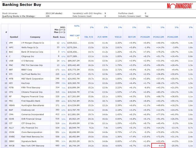
To demonstrate just how massive this is, I pulled the entire banking sector through CPMS. There are several data points included in the chart, but I set the order to be based on the largest market capitalization. See the chart below:
The first entry on the entire chart that carries a negative price return over the last 12 months is number 24 on the list. There are very few banking stocks that are doing anything less than good – the vast majority is doing exceptional. Returns in the 40% to 70% range are common for the period and sector. That isn’t the sign of a perfectly functioning economy – it is a bet on interest rates going up. Investors are hoping the Federal Reserve will pay more money to the banks as a reward for not lending money, this is known as interest on excess reserves. The Federal Reserve, last we knew, was planning to hike rates twice more in 2017 (three times total). As of 06/14/2017, the second hike came through for the year but “disappointing” numbers on Core CPI and retail sales drove what bond investors have been saying. The economy simply isn’t that strong.
How I’m Investing
I take a very defensive approach to portfolio construction. While I’m holding common equity in a few dividend champions, namely Altria Group (NYSE:MO), Philip Morris (NYSE:PM), Wal-Mart (NYSE:WMT), and Target (NYSE:TGT), I’m also carrying positions in a couple other companies. On the morning of 06/16/2017, I bought shares of Sprouts (NASDAQ:SFM) within a few pennies of $20.00 because I felt the negative reaction to Amazon (NASDAQ:AMZN) buying Whole Foods (NASDAQ:WFM) was a severe overreaction. The stock was cratering from a very recent high of $25.98. The same morning I added shares of Target within a few pennies of $50. It’s ironic how on those huge declines the stocks can end up hitting right around a round number in the early volatility. It’s hard to believe in market efficiency when that is happening.
I’m also investing heavily in a few of the high yield securities. Namely I’m investing in baby bonds and preferred shares from REITs, especially mortgage REITs. The very high yields in this space, 7% to 9%, create a solid return so long as there is no major decline in share price. For the common stock, prices are very volatile. For the preferred shares, volatility is dramatically lower. If interest rates suddenly “normalized” at 5%, I’d be in a rough position. I don’t think 5% is even remotely normal in this scenario. Global bond rates remain at historically low levels because the rest of the world doesn’t expect GDP growth to fill the “pie-in-the-sky” dreams. Will American optimism drive up yields across the globe? I highly doubt the American optimism can create that much upward pressure on government bond yields.
So long as Treasury yields aren’t flying dramatically higher, the income off of preferred shares offers a solid return. Due to poor liquidity within the sector, prices can be a bit irrational. Consequently, I trade more frequently in this space to keep targeting the shares that I believe are undervalued. The wider bid-ask spreads are a problem for the person crossing the spread, but not so bad for the investor who is confident in their buy-limit and sell-limit prices.
The attractiveness of the preferred shares has been up and down over the last few months. The space requires some extra patience since occasionally the whole sector will get slightly overvalued or undervalued. Some weeks a quarter of the securities are in the buy range and some weeks it is only 5% or so.
Conclusion
The broad equity markets are priced for incredible levels of optimism. This optimism does not appear to be supported by any of the macroeconomic fundamentals. Quarterly profits after tax are high relative to GDP and wages are low. Growth in earnings to justify the share prices must come through either earnings taking up a larger share of the pie or growth in the entire pie. If investors are content to believe that it is the entire pie that will grow, they have to reconcile a low labor force growth rate, many years of weak productivity growth, and declining/stagnant average working hours.
Investors who don’t want to buy into those theories can either maintain substantial cash allocations or look to alternative options such as preferred shares. With a more defensive allocation that emphasizes stable prices and strong yields, they can still look to produce a solid amount of income without as much exposure to a correction when the earnings growth disappoints over the next several years.
If you want to know more about finding the best opportunities in preferred shares, consider joining my service for the best research on preferred shares. In addition to constantly updating models with clear buy and sell target prices, I also offer free text message and e-mail alerts when I find a great deal. Anyone who signs up before July 1st, 2017 will be able to lock in annual rates at only $330 per year.


