A Look Back At 1999!
March 6th, 2017 by Jason B. Vanclef
Mar 5, 2017 1:39 PM
Via RealInvestmentAdvice.com, [4]
On Friday, I penned: [5]
“The question that must be answered is just how much of the benefit from these fiscal proposals have already been priced in perfection? What happens if tax reform is less than anticipated? Or infrastructure spending is cut from $1 Trillion to $500 billion? Or repatriation only brings back a fraction of the dollars anticipated?
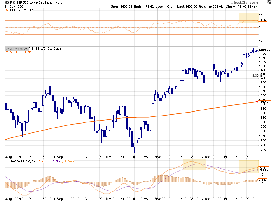
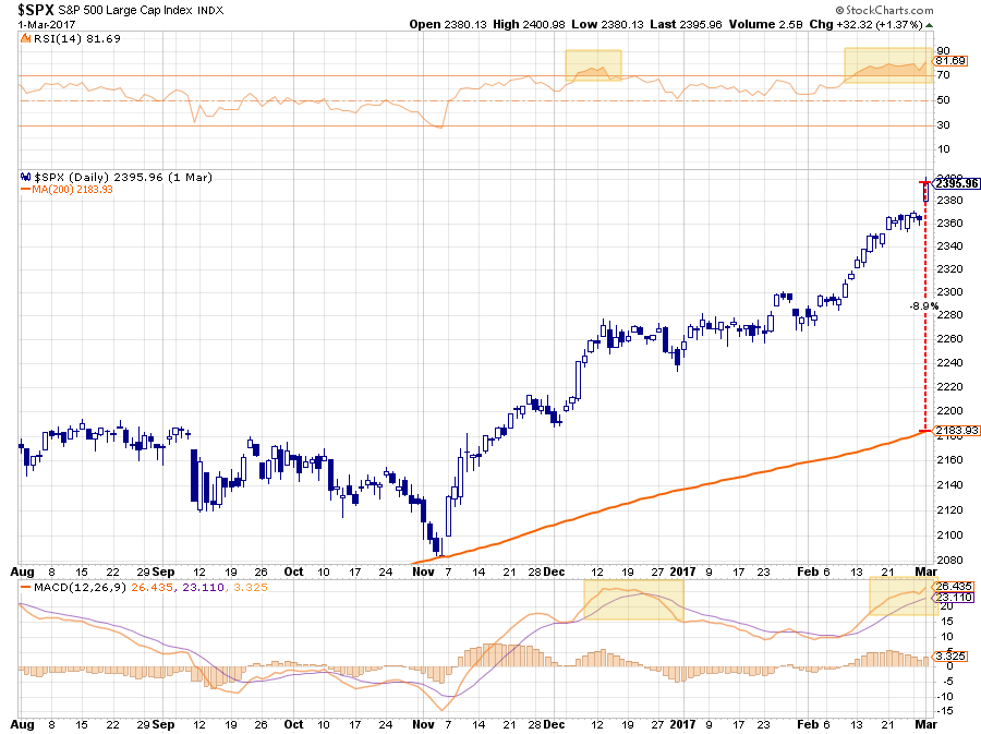
Let’s zoom out for a second and look at the pre- and post-election through the end of last year for clarity.”
“Oh, shoot!….Sorry, that was 1999. Here is last year.”
It did surprise how similar the two patterns were to each other, with both of them getting nearly 9% above their 200-day moving averages.
But similarities in price actions alone do not necessarily equate to problems for investors.
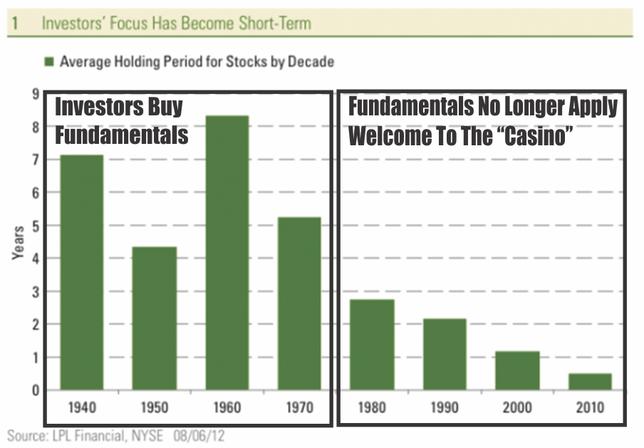
Today, due to the impact of technology, online investing, high-frequency trading, dark pools, hedge funds, etc., prices are more of a reflection of short-term investor sentiment rather than a reflection of the long-term fundamental investing. With an average holding period of 6-months or less, a long-term fundamental case for owning an investment does not have the “time frame” necessary for the analysis to mature.
The problem with very short-term holding periods is the impact of “psychology” on investing outcomes. This is why the discussion of the rise of “animal spirits” within the markets is currently an interesting topic, given that such a rise in “exuberance” is often equated to the end, rather than the beginning, of an investment cycle.
We see the same situation in the economic backdrop as well.
If this market rally seems eerily familiar, it’s because it is. If fact, the backdrop of the rally reminds me much of what was happening in 1999.
1999
- Fed was hiking rates as worries about inflationary pressures were present.
- Economic growth was improving
- Interest and inflation were rising
- Earnings were rising through the use of “new metrics,” share buybacks and an M&A spree. (Who can forget the market greats of Enron, Worldcom & Global Crossing)
- Stock market was beginning to go parabolic as exuberance exploded in a “can’t lose market.”
If you were around then, you will remember.
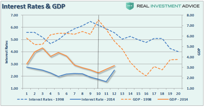
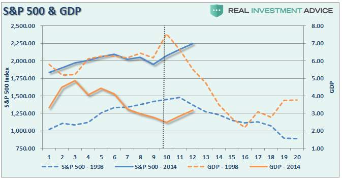
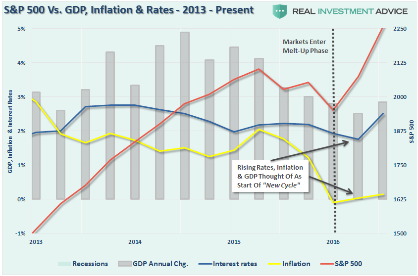
The charts below show a comparison of GDP, Inflation, Interest Rates (10-year) and the S&P 500 between 1998-2002 (dashed lines) and 2014-Present (solid lines). The data is nominal and quarterly.
While inflation rates and GDP growth are substantially weaker than in 1998, the recent turn higher is similar to what we saw during that previous period. Notice in 2000, there was a spike higher in GDP which got the bulls all excited just before the recession took hold.
The same is true for interest rates which rose about 1.5% between 1998 and 2000. Rates then resumed their long-term downtrend in conjunction with the onset of a recession.
Of course, as rates, inflation, and economic growth were rising by small amounts, investors pushed assets prices higher expecting the longest economic growth cycle on record to continue for another decade.
It didn’t.
As pointed out this past week by my partner Michael Lebowitz, all of the underlying fundamentals don’t support valuations at current levels either. To wit: [13]
“Given the declining trend of GDP and the correlation of earnings to GDP, it is fair to deduce that GDP and earnings growth trends were healthier in the late 1990’s than they are today. More specifically, the following table details key economic and financial data comparing the two periods.”
“As shown, economic growth in the late 1990’s was more than double that of today, and the expected trend for economic growth was also more encouraging than today. Trailing three- five- and ten-year annual earnings growth rates contrast the current stagnant economic growth versus the robust growth of the 90’s. Additionally, various measures of debt have ballooned to levels that are constricting economic growth and productivity. Historically low interest rates are reflective of the current state of economic stagnation.
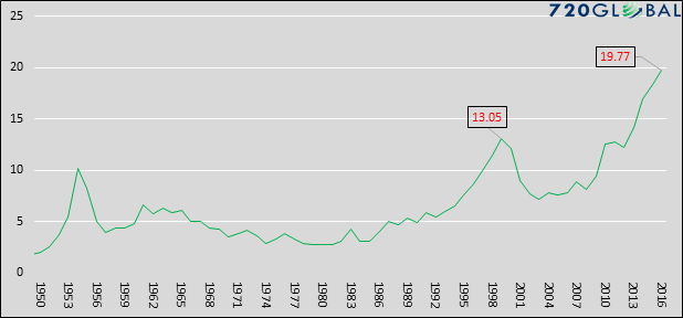
The graph below charts price-to-earnings (CAPE) divided by the secular GDP growth (ten-year average), allowing for a proper comparison of valuations to fundamentals.”
“The current ratio of CAPE to GDP growth of 19.77 has far surpassed the 1999 peak and all points back to at least 1950. At the current level, it is over three times the average for the last 66 years. Further, based on data going back to 1900, the only time today’s ratio was eclipsed was in 1933. Due to the Great Depression, GDP at that time for the preceding ten years was close to zero. So, despite a significantly deflated P/E multiple, the ratio of CAPE to GDP was extreme. Looking forward, if we assume a generous 3% GDP growth rate, CAPE needs to fall to 18.71 or 35% from current levels to reach its long term average versus GDP growth.”
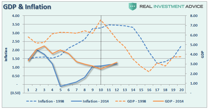
The last chart gives a better comparison.
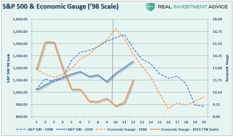
I have combined interest rates, GDP, and inflation into a single “economic index” for both the 5-year period beginning in 1998 and 2014 to present. I then recalibrated the 2014 index and market to 1998 levels.
This is where it gets interesting. If you look at the chart you would quickly make the argument that we have 8-10 quarters ahead of us before a problem occurs. However, because we are running at HALF of the previous rate, there is substantially less room to fall before a recession sets in. In other words, in 1998, the economy had to decline from a 7.5% growth rate to hit recessionary levels.
Considering we are at 2% today, the time to recession will be considerably shorter – like 2-4 quarters kind of short.
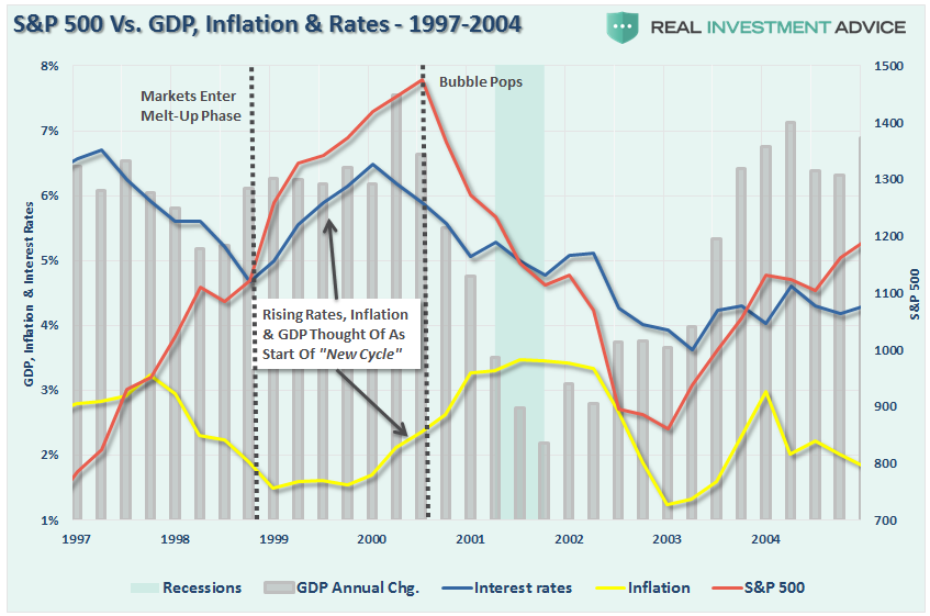
For the skeptics, here is the actual data graphed from 1997-2014. Stocks entered the melt-up phase as the “Bullish Mantra” changed from:
Lower rates and lower inflation is good for stocks
To:
Higher rates and higher inflation is good for stocks
The mantra of higher inflation and higher rates is good for stocks has once again returned as stocks enter their “melt-up” phase of the advance. As shown above, it wasn’t the case then and it likely won’t be the case now.
While there is much hope the new President, and his newly minted cabinet, will “Make America Great Again,” there can be a huge difference between expectations and reality. And, like in 1999, there is just the simple realization that eventually excesses will mean revert.
But like I said, with only a 6-month holding periods, fundamentals “need not apply.”
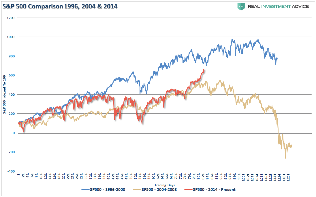
So, while I don’t like chart price comparisons in general, if you take the sum of the economic and fundamental data above and compare it to previously “overly exuberant” periods, you see this:
Note: S&P 500 has been indexed to 100 to compare price movement during the 1200 trading days measured.
Here is the point.
As I discussed above, there is a tremendous amount of rationalization by investors who have never lived through a bear market grasping at a fading number of straws to support a bullish bias.
However, it is NOT the “bullish bias” we need to support.
We are already invested.
We need to be paying attention to what eventually causes the “bullish bias” to end.


